When Quidel Corporation and Ortho Clinical Diagnostics joined forces to create a new global leader in medical diagnostics, they needed a comprehensive new brand to unite the company.
My team at Siegel+Gale developed an innovative identity system for QuidelOrtho that embodies the company’s commitment to transforming diagnostics into a healthier future for all. The new brand expands into a robust product ecosystem and springs to life across an extensive range of audience touchpoints.
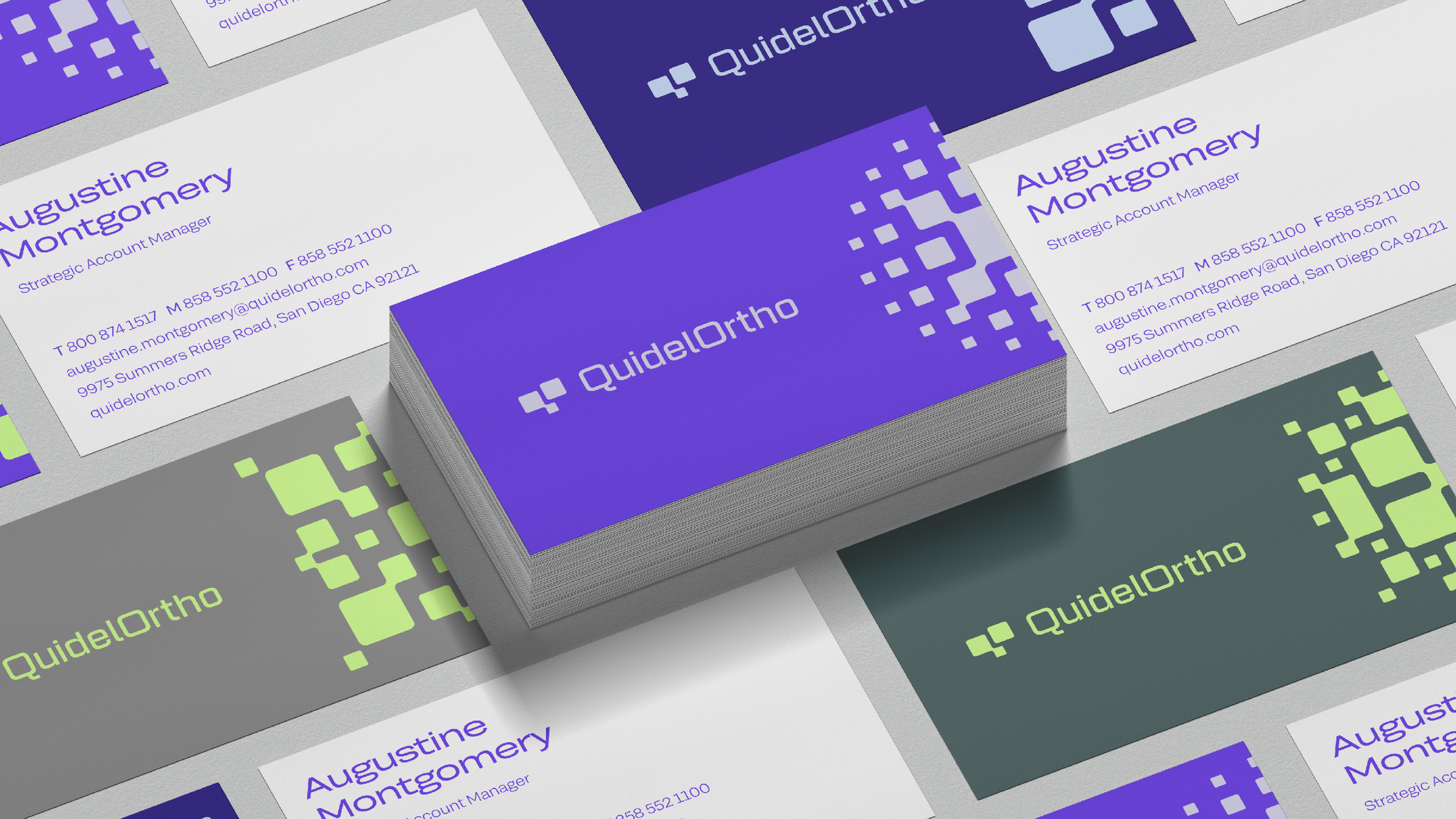
Shared design DNA is expressed throughout the system, from the stylized Q and O of the logo (which was named among the Best Monograms of 2023 by Brand New) to the system of dynamic radial patterns. The brand conveys joy and humanity while also feeling precise and trustworthy.
QuidelOrtho’s distinctive new visual identity sets the company apart from its industry competitors.
The product-level branding system unifies an expansive portfolio by granting each product its own combination of colors and patterns. The result is an ecosystem of interrelated product brands with shared design DNA.